


Unlocking Business Insights With Executive Dashboards
In today’s fast-paced business world, keeping track of your company’s performance is essential. Data-driven decisions are the key to growth and maintaining a competitive edge, regardless of your company’s size. Remember the days of endless spreadsheets? Thankfully, data visualization and business intelligence have evolved, leading to the creation of the executive dashboard.
These dynamic tools consolidate key performance indicators (KPIs) from various departments into a single, unified view. A well-designed executive dashboard isn’t just about attractive charts; it’s a strategic asset. It empowers leaders to spot opportunities, anticipate challenges, and guide their organizations toward success.
Whether you’re a startup founder, managing a growing SME, or navigating a complex industry like SaaS, FinTech, or HealthTech, understanding the power of executive dashboards is crucial. This article explores eight diverse executive dashboard examples, providing inspiration and practical knowledge to help you build dashboards tailored to your specific business needs.
Understanding the Value of Executive Dashboards
Executive dashboards offer a clear, concise overview of your company’s most important metrics. This allows for quick identification of areas needing attention and facilitates more informed, strategic decision-making.
- Improved Visibility: Gain a comprehensive understanding of your business performance.
- Enhanced Decision-Making: Make faster, data-backed decisions.
- Increased Efficiency: Save time by accessing all key data in one place.
- Better Collaboration: Foster data transparency and collaboration across teams.
Eight Examples of Executive Dashboards in Action
Let’s look at some examples of how executive dashboards can be applied across different business functions:
- Sales Dashboard: Track sales performance, conversion rates, and customer acquisition cost.
- Marketing Dashboard: Monitor website traffic, social media engagement, and marketing campaign ROI.
- Financial Dashboard: Oversee revenue, expenses, and profitability.
- Customer Service Dashboard: Analyze customer satisfaction, resolution times, and support ticket volume.
- Project Management Dashboard: Track project progress, milestones, and resource allocation.
- HR Dashboard: Monitor employee turnover, performance metrics, and training progress.
- IT Dashboard: Oversee system uptime, security incidents, and network performance.
- Executive Overview Dashboard: Get a high-level view of all key business areas.
Building Your Own Executive Dashboard
Creating an effective dashboard requires careful planning and consideration of your specific needs. Here are some key steps to get started:
- Define Your Objectives: What do you want to achieve with your dashboard?
- Identify Key Metrics: Which KPIs are most important to track?
- Choose the Right Tools: Consider platforms like Tableau or Power BI for creating interactive dashboards.
- Design for Clarity: Use clear visuals and easy-to-understand data representations.
- Regularly Review and Refine: Ensure your dashboard remains relevant and insightful.
By following these guidelines, you can create a powerful tool to unlock the full potential of your data and drive business success.
Sales Performance: An Executive Overview
For executives in fast-moving industries like SaaS, FinTech, and HealthTech, keeping a close eye on sales performance is critical. A Sales Performance Executive Dashboard provides a centralized view of key revenue metrics, pipeline data, and team performance. This allows C-suite executives, startup founders, and business leaders in SMEs to quickly assess the overall health of their sales operations. They can identify growth opportunities and track progress toward revenue targets.
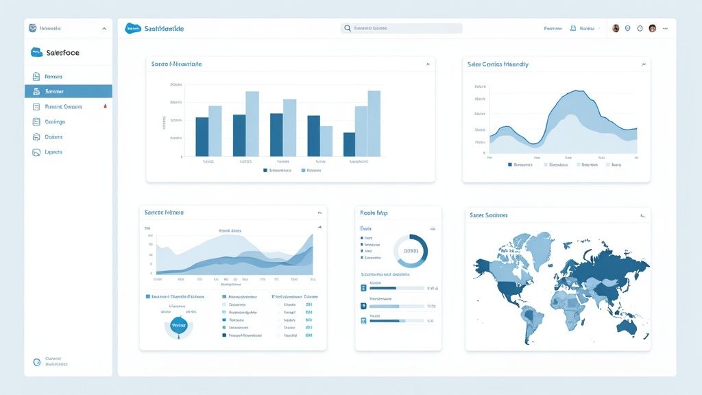

This type of dashboard is essential because of its direct impact on strategic decision-making. Features like real-time revenue tracking against targets, visualized sales pipelines with conversion rates, and geographic performance heatmaps offer immediate insights. These insights clearly show what strategies are effective and which ones need adjustment. Imagine a SaaS startup founder quickly identifying a lagging region through the dashboard and immediately adjusting marketing spend or sales team focus.
This highlights the importance of actionable data. Entrepreneurs facing challenges in executive recruitment can use this data to demonstrate revenue growth potential to prospective candidates. The ability to quickly adapt and respond to changing market conditions can be the difference between success and failure.
Features and Benefits of an Executive Dashboard
Features like sales rep performance comparisons, trend analysis with predictive forecasting, customer acquisition cost metrics, and deal velocity indicators further empower data-driven decisions. This affects resource allocation and future strategy. A FinTech company, for example, could use deal velocity insights to optimize its sales cycle and accelerate revenue growth.
- Real-Time Revenue Tracking vs. Targets: This provides constant visibility into progress and quickly flags potential shortfalls.
- Sales Pipeline Visualization With Conversion Rates: This offers a clear picture of deal flow and helps identify bottlenecks in the sales process.
- Geographic Performance Heatmaps: Quickly pinpoint high-performing and underperforming regions.
- Sales Rep Performance Comparisons: This facilitates performance management and identifies top performers.
- Trend Analysis With Predictive Forecasting: Enables proactive planning and efficient resource allocation.
- Customer Acquisition Cost Metrics: Helps optimize marketing spend and improve ROI.
- Deal Velocity Indicators: This reveals the speed of sales cycle progression.
Pros and Cons of a Sales Dashboard
Understanding the advantages and disadvantages of implementing a sales dashboard is important for making informed decisions.
Pros:
- Provides immediate visibility into sales performance.
- Enables data-driven decision making for resource allocation.
- Identifies underperforming regions or products quickly.
- Facilitates accurate revenue forecasting.
- Aligns sales activities with executive-level strategic goals.
Cons:
- May oversimplify complex sales processes.
- Can create excessive focus on lagging indicators.
- Requires consistent data quality across multiple sources.
- May not capture qualitative aspects of customer relationships.
Examples and Implementation Tips
Examples of popular sales dashboards include Salesforce Executive Sales Dashboard, Microsoft Dynamics 365 Sales Executive View, and HubSpot’s Executive Revenue Dashboard.
Tips for Implementation:
- Limit metrics to those directly tied to strategic objectives.
- Include both leading and lagging indicators for a balanced perspective.
- Ensure mobile accessibility for on-the-go executives.
- Implement drill-down capabilities for investigating anomalies.
- Update in real-time or at least daily for timely decision-making.
The Evolution of Sales Dashboards
The evolution of these dashboards has been significantly influenced by the rise of business intelligence and analytics platforms like Tableau and Microsoft Power BI. These tools simplify connecting to various data sources, creating visually appealing dashboards, and sharing insights across organizations. Exploring interactive visualizations can enhance dashboard utility, potentially by leveraging resources like those found on https://useshiny.com/video-sitemap-1.xml. Consider also reading articles about integrating predictive analytics into your sales dashboards for improved forecasting. This continuous development is driving the trend towards more real-time, interactive, and predictive sales performance dashboards, ultimately benefiting businesses of all sizes.
Financial Performance Dashboard
A Financial Performance Dashboard gives executives a real-time overview of their organization’s financial health. It brings together key performance indicators (KPIs), trend analyses, and core financial statements into an easy-to-understand visual format. This allows executives to quickly see the company’s financial strengths and weaknesses, identify new trends, and focus on areas needing immediate action. For startups, small and medium-sized enterprises (SMEs), and even large corporations, understanding and using a financial performance dashboard can be crucial for sustainable growth and smart decisions.
Why It’s Essential for Executives
This dashboard is important because of its vital role in guiding financial strategy. It goes beyond static reports, offering active insights that empower executives to make data-driven decisions. Imagine a SaaS startup trying to secure its next round of funding. A financial performance dashboard can immediately show revenue growth, customer acquisition cost (CAC), and other essential metrics that investors look at. A HealthTech company can track KPIs related to operational efficiency, how resources are allocated, and profitability, enabling informed decisions that support future growth.
Key Features and Benefits
- Cash flow visualization: See your cash inflow and outflow, critical for managing working capital.
- Profit and loss summary: A quick overview of your overall profits.
- Budget variance analysis: Track actual performance against the budget to identify overspending or unexpected savings.
- Revenue and expense breakdowns: Get detailed insights into what drives your financial performance.
- Financial ratios (ROI, ROA, Debt-to-Equity): Essential for evaluating investment returns, asset use, and financial leverage.
- Working capital metrics: Monitor the company’s short-term financial health and liquidity.
- Forecasted financial performance: Project future financial outcomes based on current trends.
Pros
- Centralized Information: All essential financial data is easily accessible in one place.
- Early Warning System: Identify potential financial problems before they become serious.
- Faster Decisions: Access to real-time data allows for quicker, more informed decisions.
- Increased Transparency: Easily share key financial information with stakeholders like investors and board members.
- Better Resource Allocation: Focus resources on the most profitable and impactful areas.
Cons
- Data Security: Protecting sensitive financial data requires strong security measures.
- Visualization Complexity: Careful design is needed to clearly visualize complex financial concepts.
- Data Accuracy: The dashboard’s effectiveness depends on accurate and timely data entry.
- Customization Needs: A one-size-fits-all approach may not work for specific industries.
Real-World Examples and Case Studies
Large companies like Coca-Cola have used financial dashboards to get a clearer view of their global operations. This allows them to optimize pricing, inventory management, and distribution strategies. Specific case study details are often kept private because of the sensitive nature of financial data. However, the wide use of these tools by Fortune 500 companies shows their effectiveness.
Evolution and Popularity
The growth of cloud computing and business intelligence (BI) tools has made sophisticated financial dashboards more accessible. Software solutions like Oracle NetSuite, Adaptive Insights by Workday, SAP Financial Analytics, and even QuickBooks Advanced offer robust dashboard features. Publications like CFO Magazine have also helped promote best practices in financial visualization.
Practical Implementation Tips
- Threshold Alerts: Set up alerts for critical financial metrics to be notified if they fall outside expected ranges.
- CFO Input: Involve the CFO in the design process to ensure the dashboard meets the finance team’s needs.
- Access Controls: Use role-based access controls to protect confidential financial data.
- Balanced Indicators: Include both short-term and long-term financial indicators for a complete view.
- Compliance: Ensure the dashboard complies with financial reporting standards and regulations.
By using a financial performance dashboard, executives in any industry can better understand their organization’s financial health. This empowers them to make smart, strategic decisions that drive growth and success.
Operational KPI Dashboard
An Operational KPI Dashboard offers executives real-time insights into their business’s core functions. Unlike dashboards tracking high-level strategic metrics, this one emphasizes the efficiency and performance of daily operations. It bridges strategic goals and tactical execution, allowing for quick identification of bottlenecks and process optimization. This is particularly relevant for fast-paced industries like SaaS, FinTech, and HealthTech where operational agility is essential.
This dashboard offers a detailed view of key operational metrics, including:
- Production Efficiency: Units produced per hour, defect rates
- Supply Chain Performance: Order fulfillment time, inventory turnover, supplier lead times
- Quality Control: Customer returns, error rates, warranty claims
- Resource Utilization: Employee productivity, equipment uptime, material usage
- Process Cycle Time: Time to complete key processes, from order to delivery
- Capacity Utilization: Percentage of available capacity used
- Operational Risk: Safety incidents, compliance violations
Tracking these metrics provides executives with a clear picture of operational effectiveness and highlights areas for improvement.
Pros of Using an Operational KPI Dashboard
- Strategic Alignment: Connects daily operations to overall business goals.
- Rapid Issue Identification: Real-time data allows quick diagnosis of operational problems.
- Proactive Decision-Making: Data-driven insights empower informed adjustments.
- Resource Optimization: Highlights areas for better resource allocation across departments.
- Expenditure Justification: Provides context for operational spending and investment decisions.
Cons of Using an Operational KPI Dashboard
- Information Overload: Too many metrics can be overwhelming. Focus on the most critical KPIs.
- Data Dependency: Requires reliable data collection across all operations.
- Short-Term Focus: May prioritize quick fixes over long-term strategic improvements.
- Customization Needs: Industry-specific operations may require significant dashboard customization.
Real-World Examples and Case Studies
Companies like GE Digital (Predix Operations Dashboard), Domo (Manufacturing Executive View), Siemens (MindSphere Operational Intelligence Dashboard), and IBM (Maximo Operations Center) offer robust operational dashboards. While specific case studies are often confidential, these tools’ impact is clear. Manufacturers using them report reduced downtime, improved production throughput, and optimized inventory management.
Evolution and Growing Popularity
Operational dashboards gained traction with the rise of the Toyota Production System and its focus on continuous improvement. This, combined with advances in data analytics and visualization, led to sophisticated real-time dashboards. Companies like GE Digital and Siemens further broadened access to these tools across various industries.
Practical Implementation Tips
- Prioritize Key Metrics: Focus on the most vital KPIs for your business.
- Incorporate Proven Methodologies: Use Six Sigma or Lean metrics where suitable.
- Utilize Visual Cues: Consistent color-coding shows performance levels at a glance.
- Track Progress: Include trend lines to visualize improvement over time.
- Balance Indicators: Use both leading and lagging indicators for a comprehensive view.
The Operational KPI Dashboard plays a vital role in connecting strategy and execution. For businesses of all sizes, it provides real-time insights for operational excellence and sustainable growth. It’s particularly helpful for companies seeking cost-effective leadership by offering data-driven visibility into resource allocation and operational efficiency.
Customer Experience Executive Dashboard
Understanding the customer experience is crucial for any business, especially for growing startups and SMBs. A Customer Experience Executive Dashboard provides a central view of key customer metrics, empowering leaders to make informed decisions. This tool is invaluable across diverse sectors, from SaaS and FinTech to HealthTech.
This dashboard combines essential metrics like Net Promoter Score (NPS), Customer Satisfaction (CSAT), Customer Effort Score (CES), churn and retention rates, and Customer Lifetime Value (CLTV). It also includes qualitative data, like Voice of Customer (VoC) feedback, offering a complete picture of the customer journey.
By visualizing these metrics, executives gain direct insight into customer sentiment and loyalty, linking customer experience to financial performance. For instance, a CSAT score drop in a specific customer segment could correlate with decreased revenue from that segment, prompting targeted action.
The growing popularity of these dashboards can be attributed to companies like Qualtrics and Medallia, along with research from CustomerThink and methodologies like Forrester’s Customer Experience Index. These resources emphasize customer-centricity and provide frameworks for measurement and improvement. This focus has driven the development of advanced dashboarding tools.
Features of a Customer Experience Executive Dashboard
- Net Promoter Score (NPS) tracking: Measures customer loyalty and likelihood to recommend.
- Customer Satisfaction (CSAT) metrics: Measures satisfaction with specific interactions or overall experience.
- Customer Effort Score analysis: Assesses the ease of company interaction.
- Customer churn and retention rates: Monitors customer loss and loyalty.
- Customer Lifetime Value visualization: Projects total revenue generated by a customer.
- Voice of Customer feedback summaries: Offers qualitative insights into customer sentiment.
- Customer journey stage performance: Analyzes performance at each lifecycle stage.
Pros
- Provides direct insight into customer sentiment and loyalty.
- Links customer experience to financial outcomes.
- Identifies customer pain points needing immediate attention.
- Helps prioritize customer experience investments.
- Fosters a customer-centric culture.
Cons
- Subjective metrics can be influenced by response bias.
- Establishing direct causation between experience metrics and business outcomes can be challenging.
- May oversimplify complex customer relationships.
- Requires consistent data collection across channels.
Examples of Customer Experience Executive Dashboards
- Qualtrics XM Executive Dashboard
- Medallia Experience Cloud for Executives
- Zendesk Customer Experience Analytics
- Adobe Experience Cloud Executive View
Tips for Implementation
- Segment metrics by customer value tiers: Focus on high-value customers.
- Include competitive benchmarking: Understand your performance relative to competitors.
- Combine quantitative metrics and qualitative feedback: Gain a comprehensive view.
- Connect experience metrics to financial outcomes: Demonstrate ROI.
- Update frequently: Stay ahead of evolving customer expectations.
For businesses looking to visualize data effectively, exploring image sitemaps might be helpful, such as the resources at https://useshiny.com/image-sitemap-1.xml. Also, consider reading about Optimizing Your Executive Dashboard for Actionable Insights. This dashboard’s focus on understanding and improving the customer journey makes it a valuable tool for any leadership team, especially those in fast-paced industries seeking sustainable growth.
Marketing Performance Dashboard Insights
A Marketing Performance Dashboard is essential for executives to understand their marketing efforts and their impact on the bottom line. It offers a central view of key metrics, linking activities to outcomes like revenue and customer acquisition. This empowers data-driven decisions about strategy, budget, and channel optimization. Its ability to demonstrate marketing’s contribution to overall business success makes it a must-have.
This dashboard goes beyond superficial metrics like likes and followers. It focuses on showcasing marketing’s tangible impact on growth. It connects marketing activities to financial results, justifying investments and highlighting areas for improvement. This is especially valuable for startups and SMEs looking to maximize resources and demonstrate ROI to investors.
Features and Benefits
A robust Marketing Performance Dashboard typically includes:
- Marketing ROI by Channel and Campaign: Shows which channels and campaigns generate the highest return, enabling data-driven budget decisions.
- Customer Acquisition Cost (CAC) Analysis: Tracks the cost of acquiring new customers, allowing for spending optimization.
- Conversion Rate Visualization across Funnel Stages: Visualizes the customer journey and identifies bottlenecks for targeted improvements.
- Brand Awareness and Sentiment Tracking: Monitors brand perception, providing insights into brand health and reputation.
- Market Share Indicators: Tracks market share and identifies growth opportunities.
- Campaign Performance Comparisons: Compares different campaigns, highlighting best practices.
- Digital Marketing KPIs: Provides insights into website traffic, engagement, and click-through rates.
Pros
- Demonstrates marketing’s impact on business results.
- Enables data-driven budget allocation.
- Identifies high and low-performing initiatives.
- Facilitates strategy adjustments.
- Improves marketing accountability.
Cons
- Attribution Challenges: Accurately assigning credit to specific marketing touchpoints can be difficult in complex customer journeys.
- Digital Emphasis: Digital metrics are often easier to track, potentially skewing the overall view.
- Short-Term Focus: May overemphasize short-term metrics over long-term brand building.
- Data Silos: Data silos can create incomplete performance views.
Real-World Examples
Many case studies demonstrate the effectiveness of these dashboards. A SaaS company using HubSpot’s Marketing Hub Executive Dashboard might track inbound marketing ROI and discover content marketing generates the highest quality leads. This allows them to reallocate budget. An e-commerce business using Google Marketing Platform could analyze customer acquisition cost across advertising platforms and optimize bidding strategies.
Dashboard Examples
- Google Marketing Platform executive view
- HubSpot Marketing Hub Executive Dashboard
- Marketo Engage Executive Insights
- Supermetrics C-Suite Marketing Dashboard
Evolution and Growth
The evolution of analytics platforms like Google Analytics and methodologies like Marketing Evolution have popularized these dashboards. The rise of marketing automation platforms like Salesforce Marketing Cloud and best practices from organizations like the CMO Council have further cemented their importance.
Implementation Tips
- Focus on business outcomes, not vanity metrics.
- Include competitor benchmarking.
- Connect marketing to revenue.
- Provide both campaign-specific and overall performance views.
- Include predictive elements for future performance.
By using a well-designed Marketing Performance Dashboard, businesses can understand their marketing effectiveness, optimize strategies, and drive better results. This makes it a valuable tool for executives in various industries.
Human Resources Executive Dashboard: A Strategic Tool for Modern Businesses
A Human Resources Executive Dashboard offers a comprehensive overview of vital workforce metrics. It empowers leadership to make informed, data-driven decisions regarding talent management, employee engagement, and overall organizational well-being. Connecting people analytics to business outcomes is its core strength, making it an essential resource for businesses today, especially in dynamic sectors like SaaS, FinTech, and HealthTech. For startups and SMBs, it presents a cost-effective alternative to traditional, often expensive, consulting services.
This dashboard transcends basic HR reporting, providing strategic insights into human capital trends and potential challenges. It can, for instance, highlight emerging skill gaps, forecast employee turnover, and evaluate the efficacy of learning and development initiatives. This proactive approach allows executives to address workforce issues effectively and optimize talent strategies.
Key Features and Benefits
- Headcount and Turnover Analysis: Monitor employee numbers, track turnover rates, and pinpoint contributing factors.
- Employee Engagement Scores: Evaluate employee satisfaction, identify areas for improvement, and link engagement with productivity.
- Talent Acquisition Metrics: Analyze time-to-hire, cost-per-hire, and quality of hire to streamline recruitment processes.
- Diversity and Inclusion Indicators: Measure demographic representation and pinpoint areas for enhancing D&I efforts.
- Compensation and Benefits Benchmarking: Compare compensation and benefits packages with industry standards to maintain competitiveness.
- Learning and Development Progress: Monitor employee involvement and advancement in training programs to assess their impact on skill development.
- Succession Planning Visualization: Identify high-potential employees and create succession plans for uninterrupted leadership continuity.
Advantages of Using an HR Executive Dashboard
- Elevates HR’s Strategic Role: Transforms HR from a cost center into a strategic partner influencing business outcomes.
- Links Workforce Metrics to Business Performance: Illustrates the effect of HR initiatives on crucial business goals such as revenue growth and customer satisfaction.
- Proactive Risk Management: Enables early intervention in potential workforce challenges like employee attrition and skill deficiencies.
- Data-Driven Workforce Planning: Furnishes the data needed for effective workforce planning and resource allocation.
- Demonstrates ROI on HR Investments: Quantifies the return on investment in HR programs and activities.
Potential Challenges
- Data Privacy: Requires careful management of sensitive employee information and adherence to privacy regulations.
- Qualitative Factors: While data is essential, it’s vital to also consider qualitative factors related to workplace culture.
- Legacy Systems: Integrating data from diverse systems can be a complex process.
- Measurement Difficulties: Certain HR aspects, like employee morale, can be challenging to quantify accurately.
Real-World Impact
Although specific examples involving confidential HR data are seldom publicized, the influence of HR dashboards is apparent in the accomplishments of companies that emphasize data-driven HR practices. Organizations like Google, renowned for their innovative people analytics approach, utilize dashboards to comprehend employee requirements and optimize workforce performance.
Evolution and Growing Popularity
The growth of people analytics and the accessibility of advanced HR technology platforms have propelled the adoption of HR executive dashboards. Influential entities like Deloitte, with their Human Capital Trends reports, and industry leaders like Workday, SHRM, and the Josh Bersin Academy, have further promoted the concept.
Practical Implementation Tips
- Predictive Analytics: Forecast future workforce needs by incorporating predictive modeling.
- Strategic Alignment: Align HR metrics with overall business goals to showcase their impact.
- Data Security: Implement strong data security measures and comply with privacy regulations.
- Industry Benchmarking: Compare your metrics against industry averages to identify improvement areas.
- Balanced Approach: Consider both quantitative performance data and qualitative cultural insights for a comprehensive perspective.
Examples of HR Executive Dashboards
- Workday HCM Executive Dashboard
- Microsoft Power BI HR Analytics Template
- Oracle HCM Cloud Executive View
- SAP SuccessFactors Workforce Analytics
By offering a clear, concise view of critical workforce data, the HR Executive Dashboard equips leaders with the knowledge necessary to make informed choices, optimize human capital, and drive business success. This makes it a vital asset for any organization, particularly startups and SMBs seeking a competitive advantage.
IT Performance and Security Dashboards: A Vital Tool for Executives
An IT Performance and Security Dashboard offers executives a centralized overview of their organization’s technology. This dashboard transforms complex technical data into understandable business insights. This allows leaders to grasp technology risks, identify opportunities, and see how IT investments impact the bottom line. It’s a key part of any successful executive reporting strategy, especially for startups and SMBs experiencing rapid growth.
This dashboard’s importance lies in its ability to connect technology and business strategy. Whether a startup is seeking funding or an established company is scaling, demonstrating a clear grasp of IT performance and its relationship to business goals is essential. This dashboard provides that vital connection, showcasing IT’s value to the organization.
Key Features and Benefits
A robust IT Performance and Security Dashboard usually includes:
- System Uptime and Availability Metrics: Monitor the reliability of essential systems and services to maintain business operations.
- Cybersecurity Threat Indicators and Response Metrics: Track security vulnerabilities and how quickly incidents are addressed to reduce risks.
- IT Project Portfolio Status and Health: See the progress and effectiveness of current IT projects.
- Digital Transformation KPIs: Evaluate the success of digital transformation projects against set targets.
- IT Service Level Agreement (SLA) Performance: Monitor compliance with service agreements with both internal and external partners.
- Technology Spend Analysis: Examine IT spending to find areas for improvement and cost savings.
- Technical Debt Visualization: Grasp and address existing technical debt to prevent future issues.
Advantages of Using a Dashboard
- Translates Technical Metrics into Business Impact: Turns complex data into insights that non-technical executives can understand.
- Provides Early Warning for Technology Risks: Spots potential problems before they become major disruptions.
- Demonstrates IT’s Contribution to Business Performance: Shows how IT contributes to the overall success of the organization.
- Facilitates Informed Technology Investment Decisions: Offers data-backed insights for strategic IT planning and budgeting.
- Creates Transparency Around Technology Operations: Encourages open communication and collaboration between IT and other departments.
Potential Challenges
- Highly Technical Metrics May Need Significant Translation for Non-IT Executives: Requires carefully explaining complex data to a non-technical audience.
- Cloud Environments Create Complex Monitoring Challenges: Needs advanced tools and skills to effectively monitor cloud infrastructure.
- Security Metrics Must Balance Transparency with Sensitivity: Demands cautious management of confidential security data.
- Rapidly Changing Technology Landscape Requires Frequent Dashboard Updates: Needs continuous adjustments to remain current and effective.
Real-World Applications
Consider a fintech startup monitoring transaction speeds and security breaches or a healthtech company tracking system uptime for patient care applications. These dashboards allow for quick responses and informed decisions.
Evolution and Industry Standards
The increasing complexity of IT environments and the growing understanding of technology’s strategic role have led to the rise of IT Performance and Security Dashboards. Frameworks like Gartner’s IT Metrics, ITIL service management, the NIST Cybersecurity Framework, and publications like CIO Magazine have helped standardize and popularize these dashboards.
Examples of Dashboard Solutions
- Cisco SecureX Executive Dashboard
- ServiceNow IT Executive Dashboard
- Splunk IT Service Intelligence
- Dynatrace Digital Business Analytics
Practical Implementation Tips
- Focus on Business Impact, Not Technical Details: Present data in a way that resonates with business leaders.
- Use Visual Cues for Complex Technical Status: Simplify information with easy-to-understand visuals.
- Include Both Operational IT and Innovation Metrics: Show a complete view of IT’s performance.
- Provide Context Through Industry Benchmarking: Compare performance to industry standards to highlight improvement areas.
- Balance Performance, Risk, and Innovation Metrics: Give a comprehensive overview of IT’s value.
Using an IT Performance and Security Dashboard gives organizations a vital advantage. This tool empowers founders, executives, and entrepreneurs with the insights they need for smart decision-making, effective risk management, and driving success through technology.
Balanced Scorecard Executive Dashboard
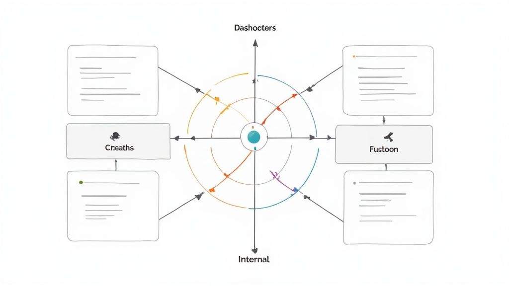
The Balanced Scorecard Executive Dashboard offers a powerful approach to strategic management, providing a comprehensive overview of organizational performance that goes beyond traditional financial metrics. Developed by Robert Kaplan and David Norton, this framework helps businesses align their activities with their overarching vision and strategy. It achieves this by focusing on four key perspectives: Financial, Customer, Internal Process, and Learning & Growth.
This makes it particularly relevant for startup founders, SMBs, and companies in fast-paced sectors like SaaS, FinTech, and HealthTech. These businesses often need to quickly and effectively translate their strategies into tangible results. The Balanced Scorecard helps them achieve exactly that.
Its inclusion in this list is well-deserved. The dashboard provides a structured methodology for both strategy execution and ongoing performance monitoring. This structured approach is crucial for businesses of all sizes, but particularly for those experiencing rapid growth or navigating industry disruption. By offering a holistic view, it helps ensure that short-term successes don’t compromise long-term value creation.
Key Features and Benefits
The Balanced Scorecard effectively visualizes strategic objectives across its four key perspectives. It highlights the crucial cause-and-effect relationships between these perspectives, providing a deeper understanding of how different areas influence overall performance. The dashboard uses performance indicators with target vs. actual comparisons, allowing executives to closely monitor progress against strategic initiatives.
- Strategic Objective Visualization: Clearly depicts goals across all four perspectives.
- Cause-and-Effect Linkages: Illustrates how objectives relate to one another.
- Performance Indicators: Tracks progress with target vs. actual comparisons.
- Strategic Initiative Tracking: Monitors the execution of key projects.
- Leading and Lagging Indicators: Offers both predictive and retrospective insights into performance.
- Strategy Map Visualization: Presents the strategic direction in a clear, visual format.
- Drill-Down Capabilities: Allows for a more detailed analysis of specific performance areas.
Pros of the Balanced Scorecard
- Holistic View: Provides a more balanced assessment by incorporating non-financial metrics.
- Strategic Alignment: Connects operational activities with strategic objectives across various departments.
- Long-Term Focus: Balances short-term results with investments in future capabilities.
- Strategic Discussions: Provides a framework for well-informed discussions and strategic decision-making.
Cons of the Balanced Scorecard
- Development and Maintenance: Requires a significant investment of time and effort to set up and maintain.
- Complexity: Can become overwhelming if it includes too many metrics.
- Executive Sponsorship: Needs strong support from leadership to be truly effective.
- Adaptability: May not be agile enough for highly dynamic and rapidly changing business environments.
Examples and Case Studies
Several software platforms facilitate Balanced Scorecard implementation. Popular options include Corporater Business Management Platform, ClearPoint Strategy Balanced Scorecard Software, ESM Software Strategy Execution System, and Spider Strategies Balanced Scorecard Solution. Harvard Business School case studies, available through their website, often showcase the application of Balanced Scorecards across various industries, providing real-world examples of its implementation and impact.
Tips for Effective Implementation
- Limit Metrics: Focus on a manageable number of key metrics (15-20) across all perspectives.
- Clear Relationships: Ensure clear cause-and-effect relationships between objectives.
- Regular Review: Review and update scorecard metrics regularly, ideally quarterly.
- Cross-Functional Involvement: Include leaders from different departments in the scorecard’s development.
- Consistent Visualization: Maintain consistent visualization elements for clarity and comparability.
Evolution and Continued Relevance
The Balanced Scorecard rose to prominence through Kaplan and Norton’s work published in the Harvard Business Review. Further development came from the Balanced Scorecard Institute and the Palladium Group (formerly Balanced Scorecard Collaborative). Their methodology provides a practical framework for translating strategy into action, resonating with businesses seeking a more holistic approach to performance management. You might also consider exploring different website structures for improved navigation. Our resources on website architecture, which you can find within our sitemap, offer valuable insights. This is especially useful for growing businesses needing to effectively organize information for potential investors and executive candidates.
8-Format Executive Dashboard Comparison
| Dashboard Type | 🔄 Implementation Complexity | ⚡ Resource Requirements | 📊 Expected Outcomes | 💡 Ideal Use Cases | ⭐ Key Advantages |
|---|---|---|---|---|---|
| Sales Performance Executive Dashboard | Moderate; integrates multiple real-time KPIs | Moderate; relies on consolidated sales data | Quick revenue insights, improved forecasting | C-suite sales decisions in medium to large organizations | Immediate visibility and data-driven decision making |
| Financial Performance Dashboard | High; complex financial analytics and security protocols | High; requires strict data governance and accuracy | Enhanced financial decision-making and early risk detection | CFOs and finance leaders in large organizations | Centralized financial info and transparency |
| Operational KPI Dashboard | Moderate–High; broad set of operational metrics | Moderate; depends on reliable real-time operational data | Identification of inefficiencies and opportunities for process optimization | Operations leaders in manufacturing, healthcare, logistics, etc. | Strategic alignment of operations and resource optimization |
| Customer Experience Executive Dashboard | Moderate; balances quantitative and qualitative data | Moderate; integrates cross-channel customer data | Holistic view of customer journey and pain point identification | Organizations focused on customer-centric strategies | Direct visibility into customer sentiment and connection to business outcomes |
| Marketing Performance Dashboard | Moderate; requires integration across digital platforms | Moderate; mix of digital and traditional marketing metrics | Data-driven channel optimization and improved campaign ROI | Marketing executives in dynamic, agile market environments | Demonstrates marketing impact and informs budget allocation |
| Human Resources Executive Dashboard | Moderate–High; involves sensitive employee and cultural data | Moderate; necessitates integration with HR systems | Strategic workforce insights, better talent planning | HR leaders in medium to large organizations focusing on talent management | Elevates HR to a strategic function with proactive risk identification |
| IT Performance and Security Dashboard | High; translates technical metrics with security challenges | High; requires robust IT infrastructure and monitoring capabilities | Early warning for IT risks and justified technology investments | IT executives managing complex systems and digital transformation initiatives | Translates tech details into business impact and provides risk alerts |
| Balanced Scorecard Executive Dashboard | High; extensive setup with continuous cross-department collaboration | High; demands integration of strategic and performance data | Holistic strategic alignment and balanced performance monitoring | Organizations aiming for integrated strategic management | Provides a balanced, comprehensive view linking strategy with performance |
Taking Action With Your Executive Dashboard
The executive dashboard examples we’ve explored, from sales and financial performance to customer experience and human resources, demonstrate the power of data visualization. By carefully choosing Key Performance Indicators (KPIs) relevant to your business needs and displaying them clearly and concisely, you empower your team to make informed, data-driven decisions. Whether you’re monitoring operational efficiency, marketing Return On Investment (ROI), or the strength of your IT security, a well-designed dashboard offers a real-time overview of your organization’s performance and pinpoints areas for improvement.
To fully utilize the potential of executive dashboards, keep these core principles in mind: prioritize clarity and conciseness, concentrate on actionable insights, and customize the dashboard to the specific needs of its users.
Regularly review and refine your dashboards to ensure they stay relevant and effective as your business grows and changes.
Gathering Feedback For Improvement
Incorporate feedback from stakeholders to continuously improve the design and functionality of your dashboards, guaranteeing they deliver maximum value. This collaborative approach helps ensure the dashboards remain a useful tool for everyone involved.
Staying Current With Data Visualization Trends
The field of data visualization is constantly developing. Stay up-to-date on new trends in dashboard design, such as the growing use of AI-powered analytics and predictive modeling. These advancements can further enhance your ability to anticipate market shifts and proactively adjust your strategies. Cultivate a culture of continuous learning and adaptation to ensure your dashboards remain powerful tools for strategic decision-making.
Key Takeaways For Effective Dashboards
- Focus: Choose the most important KPIs for your business goals.
- Clarity: Present data in a visually appealing and easily understood way.
- Actionability: Make sure your dashboard insights lead to concrete actions and positive changes.
- Adaptability: Regularly review and adjust your dashboards to reflect evolving business needs.
Building a Strong Leadership Team
Creating and maintaining effective executive dashboards is crucial for managing the complexities of business. However, assembling the right leadership team to interpret and act on these insights is equally important. Are you a startup seeking experienced executive talent without the high cost? Do you need a flexible, budget-friendly solution for expanding your leadership team? Shiny offers a unique fractional executive marketplace, connecting startups and businesses with vetted executives across more than 40 industries for 5 to 25 hours a week. Access a pool of over 650 experienced professionals, simplify your hiring process, and boost your growth with top-tier leadership. Visit Shiny today to learn how fractional executives can improve your business.