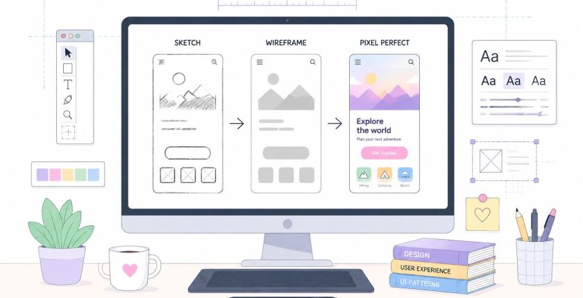
High Fidelity Wireframes: When and How to Use Them
The popular advice is simple: make wireframes as detailed as possible so everyone can see the finished product. That advice is incomplete. High fidelity wireframes can improve alignment, testing, and handoff, but they can also make a weak product decision look finished before anyone has validated it.
For founders and lean product teams, fidelity should follow the decision, not the other way around. A rough sketch is often the right tool for debating a user flow. A medium-fidelity clickable wireframe may be better for testing task logic. High fidelity becomes valuable when the team needs to assess visual hierarchy, realistic content, interaction states, accessibility conditions, or implementation detail.
The practical question isn't, “Can we make this screen more polished?” It's, “What uncertainty are we trying to remove, and what's the cheapest artifact that can remove it?”
Why More Detail Does Not Always Mean Better Decisions
More detail doesn't automatically produce better product decisions. It often produces more confident reactions to the wrong thing.
A polished screen attracts attention. Executives may comment on colors, spacing, logos, and button treatments before the team has established whether users can complete the core task. Stakeholders may also treat a wireframe that resembles a finished interface as a commitment, even when the team intended it only as an exploration. The result is stakeholder theater, where the meeting feels productive because everyone has opinions, while the fundamental product question remains unresolved.
This is one reason teams should connect fidelity to a clear decision process, rather than treating visual polish as proof of rigor. A practical framework for reducing decision drag appears in this guide to making decisions faster, and the same principle applies to design artifacts: expose the decision that matters and avoid adding detail that distracts from it.
Three ways over-specification creates drag
- The stakeholder theater problem: People review what they can see. If the interface looks branded and complete, feedback often shifts toward aesthetics instead of user goals, sequencing, or scope.
- The false precision trap: Pixel-level spacing can imply that the team has resolved questions it hasn't tested. Precision in presentation isn't the same as certainty in direction.
- The iteration tax: Every detailed screen carries more decisions to revise. A change to navigation can affect content, components, responsive layouts, states, and developer assumptions.
A prototype-fidelity study found that increasing realism from low-fidelity sketches through medium-fidelity clickable wireframes to high-fidelity static HTML pages reduced cognitive workload and improved alignment between users' mental models and the interface. However, the same study found that medium-fidelity wireframes supported faster task completion than both low- and high-fidelity conditions, which is a useful warning against assuming that maximum detail is always the most efficient testing choice (prototype fidelity study).
Practical rule: If the team is still debating information architecture, keep the artifact disposable. If the team is testing whether visual cues and interaction states communicate correctly, increase fidelity.
High fidelity is a strategic instrument. Used at the right moment, it reduces ambiguity. Used too early, it can make change feel like failure.
What High Fidelity Wireframes Actually Are
High fidelity wireframes are detailed representations of an interface that resemble the eventual product closely enough to support realistic evaluation and implementation conversations. They use more than boxes and placeholder labels. They show how typography, spacing, content, controls, and states work together under believable interface conditions.
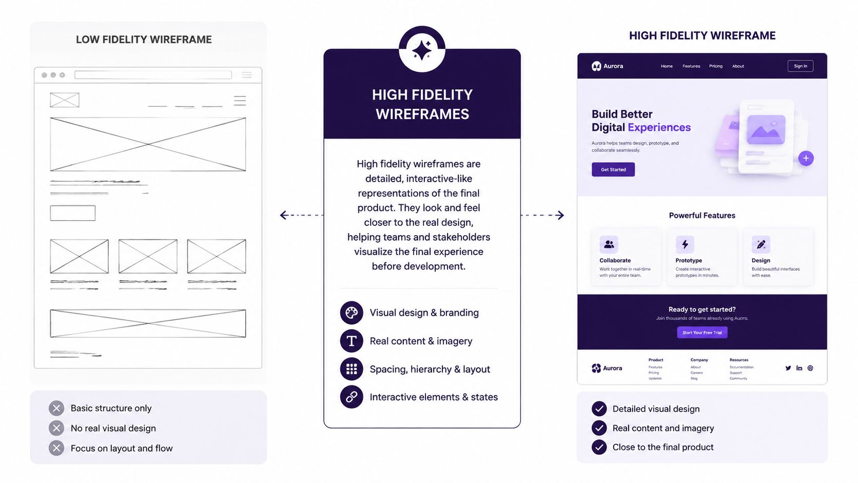
Five characteristics usually distinguish a high fidelity wireframe from a rough layout.
Visual specificity
A hi-fi artifact uses realistic typography, color choices, spacing, hierarchy, and component proportions. A low-fidelity sketch might show a rectangle labeled “navigation.” A high fidelity wireframe shows the actual navigation structure, label length, selected state, and relationship to the page content.
Content realism
Placeholder copy hides problems. Realistic content reveals whether headings wrap badly, cards become uneven, error messages fit, and calls to action remain understandable. Content doesn't need to be final, but it should be representative enough to test comprehension and layout.
Interaction definition
A detailed wireframe can document hover, active, disabled, loading, success, empty, and error states. These states matter when a team needs to understand what users see before and after an action. A static high fidelity wireframe may show the states without implementing them. A clickable prototype connects the states into a simulated flow.
Responsive behavior
A desktop screen alone doesn't define a responsive experience. Hi-fi work should show how content reflows, how controls collapse, and what happens when space becomes constrained. The exact breakpoint strategy may remain open, but the design should make responsive assumptions visible.
Component-level detail
Buttons, inputs, tables, alerts, modals, and navigation patterns should reflect the components the team expects to build. This supports developer handoff, but it also increases the cost of changing the underlying system.
A high fidelity wireframe isn't automatically a full prototype. A wireframe focuses on structure, visual decisions, and defined states. A prototype emphasizes behavior and connected user paths. Some hi-fi wireframes are clickable, but teams should decide whether they need realistic screens, realistic transitions, or both. High-fidelity prototypes are especially useful for testing visual hierarchy, content, and interaction details, a distinction also reflected in guidance from the Nielsen Norman Group usability reference.
Comparing Low, Medium, and High Fidelity Wireframes
The right fidelity depends on what the team needs to learn, who needs to understand the artifact, and how likely the requirements are to change. Low, medium, and high fidelity aren't ranks of design quality. They're different tools for managing uncertainty.
| Criterion | Low Fidelity | Medium Fidelity | High Fidelity |
|---|---|---|---|
| Time to produce | Fast and disposable | Moderate, with enough structure for repeated testing | Slowest, because visual and interaction details require definition |
| Early-stage exploration | Strong for divergent ideas, layouts, and flows | Useful for narrowing concepts and testing information hierarchy | Weak when the team is still changing direction |
| Executive alignment | Communicates broad structure, but may require explanation | Makes product logic easier to discuss without overcommitting to visual polish | Strong for showing intended visual direction, especially to non-designers |
| Usability testing value | Good for navigation and basic task sequencing | Strong for flow comprehension and interaction logic | Strong for visual hierarchy, realistic content, states, and expectation-setting |
| Developer handoff accuracy | Limited, because visual and component details remain open | Provides structural guidance and early implementation context | Strongest for exact layouts, components, states, and responsive intent |
| Cost of iteration | Low when assumptions change | Manageable, particularly with reusable patterns | Highest when foundational decisions shift |
Low fidelity earns its place early
Use sketches, whiteboard flows, or simple grayscale frames when the team is asking questions such as:
- Which steps does the user need?
- What belongs on the first screen?
- Should this action happen before or after account creation?
- Are there multiple viable navigation models?
Low fidelity makes criticism easier because nobody confuses the artifact with the finished interface.
Medium fidelity is often the workhorse
Medium fidelity gives teams enough structure to test hierarchy and task flow without forcing every visual decision. It can include realistic labels, basic components, and clickable transitions while leaving branding and detailed states open. The prototype-fidelity research cited earlier found that medium fidelity supported faster task completion than both the least and most realistic conditions, making it a sensible choice for early task-flow optimization.
High fidelity closes specific gaps
High fidelity is strongest when users or stakeholders need to respond to realistic content, visual hierarchy, component behavior, and exact interaction cues. An HCI paper on eye tracking describes high-fidelity prototypes as using materials and interactions closer to the final product, which makes them more appropriate for observing realism-dependent behavior (HCI research on prototype realism).
The mistake is choosing one level for the entire project. A lean team should move up the fidelity ladder only when the unanswered question requires it.
When to Use High Fidelity Wireframes in Your Product Process
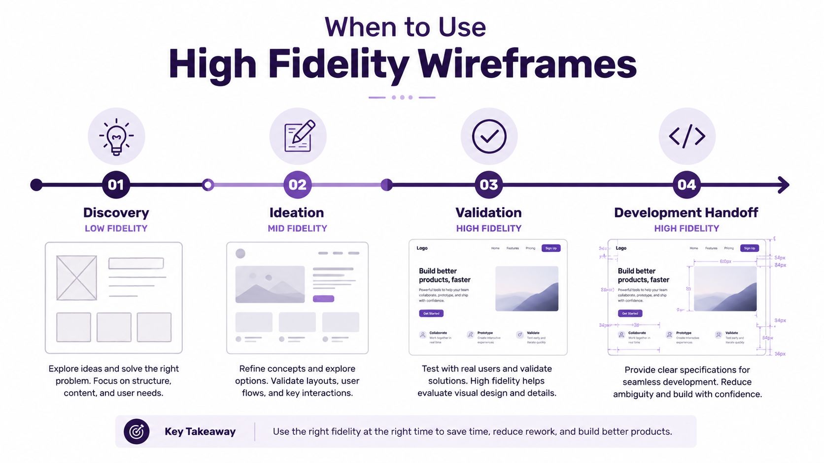
High fidelity wireframes work best at inflection points, when a specific decision depends on seeing the interface under realistic conditions. They earn their cost when the information architecture is stable, the primary flow has survived earlier testing, and a development or approval decision is close.
Discovery and ideation
Stay low fidelity while the team is learning about the problem, mapping user needs, or comparing possible flows. A founder who asks for polished screens during discovery may be asking for reassurance, not evidence. Use sketches to surface assumptions quickly and make it socially easy to discard weak directions.
Medium fidelity becomes useful once the team has a plausible flow and needs to test whether people understand the sequence. A clickable wireframe can reveal confusing transitions without consuming time on brand systems or exhaustive responsive states.
Validation
Move to high fidelity when the question involves visual interpretation or realistic expectations. Examples include:
- Testing whether users notice the primary action among competing controls.
- Evaluating dense tables, dashboards, filters, or multi-step forms.
- Checking how realistic copy affects comprehension.
- Reviewing error prevention, empty states, and recovery paths.
- Testing interactions where animation, focus, or component state changes the meaning of an action.
A commonly cited usability benchmark is that testing with 5 users can uncover roughly 85% of major usability problems, which is one reason teams often use realistic prototypes to validate important design choices before full development (Nielsen Norman Group usability services reference). The benchmark doesn't make every test high fidelity. It reinforces the need to match the artifact to the problems being investigated.
Development handoff
High fidelity is justified when engineers need clarity about exact component behavior, layout relationships, content rules, and responsive intent. It becomes particularly useful for animation-heavy interfaces, complex permissions, data-dense workflows, or products where small visual cues affect user action.
The handoff shouldn't be a file transfer. It should include states, assumptions, unresolved questions, and representative content. A detailed screen without behavior notes still leaves developers to infer important decisions.
Fundraising, compliance, and sales
Investor demos and B2B sales conversations sometimes require a polished representation because the audience is evaluating the perceived product experience before implementation. Regulated products may also need realistic screens early so compliance reviewers can assess language, disclosures, and user paths.
That doesn't mean building the whole product in hi-fi. Select the screens that carry the decision, and keep exploratory or low-risk areas cheaper. A disciplined product process, such as the one described in this overview of digital product management, treats design detail as part of delivery strategy rather than decoration.
Building High Fidelity Wireframes Without Slowing Your Team Down
Efficiency comes from reusing decisions, not from skipping them. A high fidelity workflow should make detail scalable, so a change to a button or spacing rule doesn't require manual repair across every screen.
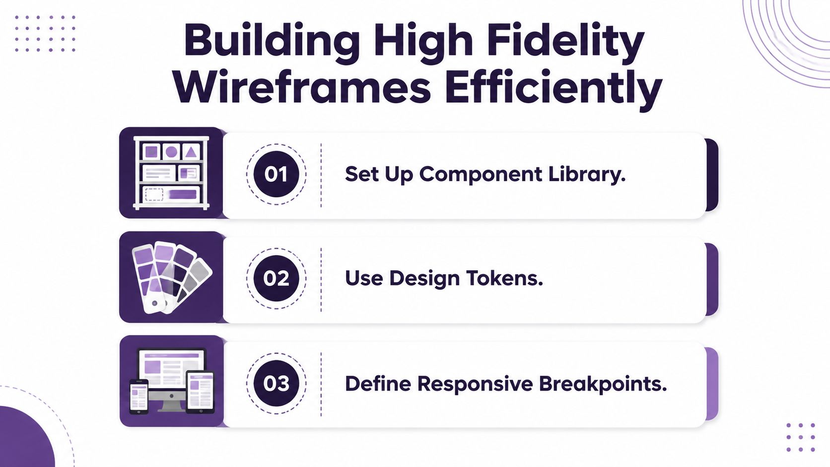
Start with a small component library
Don't begin by styling every page independently. Define the repeated elements first, including buttons, inputs, navigation, cards, tables, alerts, dialogs, and form validation. In Figma or Sketch, component variants can represent states without forcing the designer to redraw each version.
A startup doesn't need a massive design system before it validates its product. It needs a reliable set of reusable patterns that prevents visual drift and makes revision affordable. Code-based prototyping can be appropriate when interaction behavior or technical constraints matter more than visual exploration, while Figma and Sketch remain practical for collaborative screen design and handoff.
Use tokens to control change
Design tokens turn recurring decisions into named values for color, type scale, spacing, radius, and elevation. If the brand color changes, a token-based file can update consistently. Without tokens, the team may fix one screen while leaving related states inconsistent.
Keep microcopy versioned, too. A change from “Continue” to “Save and continue” can affect button width, hierarchy, and screen balance. Treat content as part of the interface, not as filler added after visual work.
Define responsive behavior and accessibility together
Map the important responsive conditions before handoff. Show how navigation, tables, forms, and cards behave when the available width changes. Don't pretend that one desktop frame explains the whole product.
Accessibility belongs in the wireframe process, not in a later audit. Recent UX trend coverage argues for considering accessibility from the first wireframe draft and emphasizes proactive experiences that anticipate user needs (UX trends and accessibility guidance). At minimum, document:
- Contrast: Check text and control contrast rather than relying on color intuition.
- Focus: Show keyboard focus states and the intended movement through the interface.
- Errors: Define prevention, inline messaging, recovery, and announcement behavior.
- Assistive technology: Annotate meaningful labels, reading order, and screen-reader context where the visual frame can't communicate them.
Prepare the handoff before sprint planning
A useful handoff package includes component references, spacing rules, interaction states, responsive notes, content assumptions, and open questions. It should tell developers what is fixed, what is flexible, and what still needs a product decision.
Before the wireframes enter planning, run a short quality check:
- Confirm the primary task and success state.
- Review every meaningful empty, loading, error, disabled, and permission state.
- Test representative content, not only ideal copy.
- Check keyboard focus and contrast.
- Verify that components and tokens are reused consistently.
- Walk the flow with an engineer and record unresolved assumptions.
For teams that need outside product or design capacity, Shiny connects startups with fractional executives through a marketplace that supports part-time leadership engagements, matching, interviews, and onboarding. A fractional product or design leader can help establish the operating rules behind a wireframe workflow, rather than merely producing another set of screens. Further UX delivery guidance is available in this resource on consultant UX design.
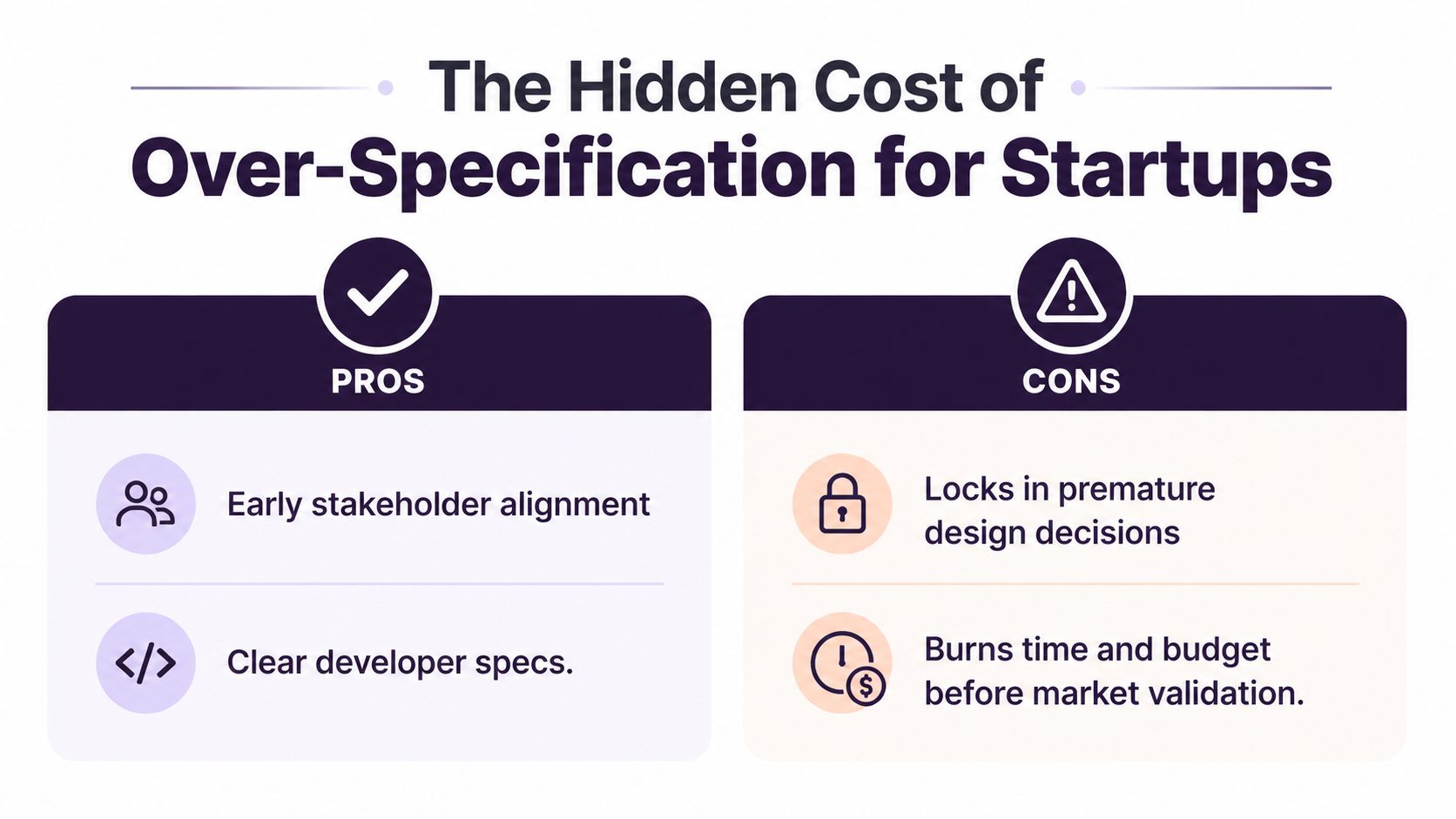
The Hidden Cost of Over-Specification for Startups
Over-specification becomes expensive when a startup mistakes a polished artifact for validated direction. The team may spend days refining visual details, then discover through customer feedback that the workflow, audience, or value proposition needs to change. The discarded work isn't the only loss. Engineers may have estimated interactions that no longer apply, and stakeholders may defend familiar visual decisions because they already invested attention in them.
This is a form of sunk-cost pressure. A high fidelity wireframe makes a decision visible, but visibility can make reversal uncomfortable. The team starts protecting the artifact instead of protecting the learning process.
Why fractional leaders see this pattern quickly
Fractional product leaders often enter after a startup has accumulated screens but lacks clear validation gates. In that context, inherited hi-fi files can indicate process debt: the team has documented the interface in detail without documenting which assumptions have been tested.
A fractional leader can reset the sequence:
- Sketch the problem: Identify the user, task, constraint, and alternative flows.
- Test the structure: Use low or medium fidelity to challenge navigation and sequencing.
- Pass a validation gate: Confirm that the core flow and information hierarchy are credible.
- Increase realism selectively: Add high fidelity only to screens where visual or interaction detail affects the decision.
- Prepare delivery evidence: Document states, accessibility requirements, and engineering assumptions.
This ladder protects optionality without treating high fidelity as waste. The artifact becomes more detailed as uncertainty decreases, not because a stakeholder asks for a prettier file.
Independent UX coverage in 2025 and 2026 has also highlighted the risk of hyper-detailed wireframes, including constrained iteration and “perfectionism paralysis,” while AI-assisted tools make polished outputs faster to produce (wireframing trends and AI collaboration). Faster production doesn't remove the need for judgment. It can make premature commitment easier.
Aligning Wireframe Strategy With Product Leadership
Wireframe fidelity reflects how a company makes decisions. Founder-led teams that are still searching for product-market fit often benefit from staying in low or medium fidelity longer. They need optionality, fast feedback, and artifacts that invite challenge rather than approval.
Growth-stage teams face a different coordination problem. As product designers, engineers, executives, and commercial teams spread across functions, high fidelity wireframes can reduce interpretation gaps. The artifact becomes a shared reference for states, content, responsive behavior, and implementation scope.
Hiring constraints make that leadership choice more consequential. A Robert Half survey found that nearly half of small and midsize business hiring managers expected salary expectations to be their biggest hiring challenge, more than 4 in 10 expected difficulty finding candidates with required skills, and nearly 4 in 10 worried about losing top candidates to competitors because of slow hiring (Robert Half hiring research). Fractional leadership can provide senior product judgment without forcing a lean company to make a full-time executive hire before its needs are stable. One industry analysis reports that UK SMEs describe 40% to 60% cost savings when comparing fractional executive hires with full-time positions (fractional leadership cost analysis).
Audit your fidelity practice quarterly. Ask which decisions your current artifacts support, where rework originates, and whether the team is using polish to compensate for missing product leadership. The right executive can establish those decision rules, align design and engineering, and increase senior capacity without expanding full-time headcount immediately. Industry coverage describes fractional executives as a flexible way to bring experienced leadership into needs such as GTM changes, M&A readiness, and AI integration (fractional executive leadership model).
Shiny connects startups and growing businesses with vetted fractional executives who can provide focused leadership across product, design, technology, sales, marketing, finance, and operations. Visit Shiny to explore flexible executive support or schedule a consultation about building a wireframe and product decision process that matches your team's stage.